Rebrand: Highest Kite Weddings
(Branding, Art Direction, Photographic Treatment, Web Design)
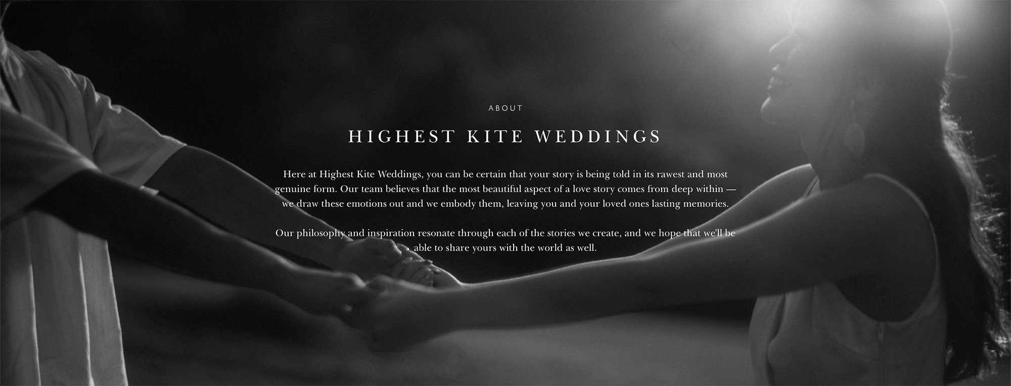
Highest Kite Weddings is a wedding videography and photography studio based in Singapore. The team believes that the most beautiful aspect of a love story comes from deep within, and bringing out the deepest emotions through visuals create some of the best love stories. They want to elevate this philosophy through their visuals; hence the decision to rebrand the brand identity, content direction, art direction and website design.
–
Analysing the Problems
01. Fonts
A quick visit to the website shows that too many fonts were used: script, sans serif and serif—all in one page.
02. Colours
There were inconsistent photographic treatment of imagery on social media and graphics. Images were edited differently: muted, saturated, in low contrast, in high contrast, warm tones, cold tones.
03. Content
(a) Social Media
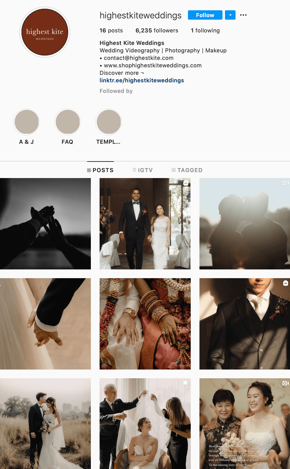
Instagram Posts were mainly videos and at first glance while scrolling through the profile; every image looks similar as cover images were mostly close up of couples. There wasn’t any depth or differentiation to each image.
Instagram Highlights can be more curated and personal. It was mostly for business; to name a few: reviews, promotions, frequently asked questions and careers. It seems that there was a lack of engagement with consumers.
(b) Website
Write ups and tone of voice of each couple’s story were too vague and not personal enough.
–
New Brand Identity
01. Fonts
Header: Baskerville
Sub-Header: VIP
Body: Baskerville
02. photographic treatment
Weddings and engagements are happy events; it’s a celebration and events are often intimate and evoke emotions and feelings. I wanted visuals to elevate the emotions and the warmth of the event. At the same time, I wanted a photographic treatment that could be referenced to use in both photos and videos.
(a) Treatment 01: Suited for almost any imagery
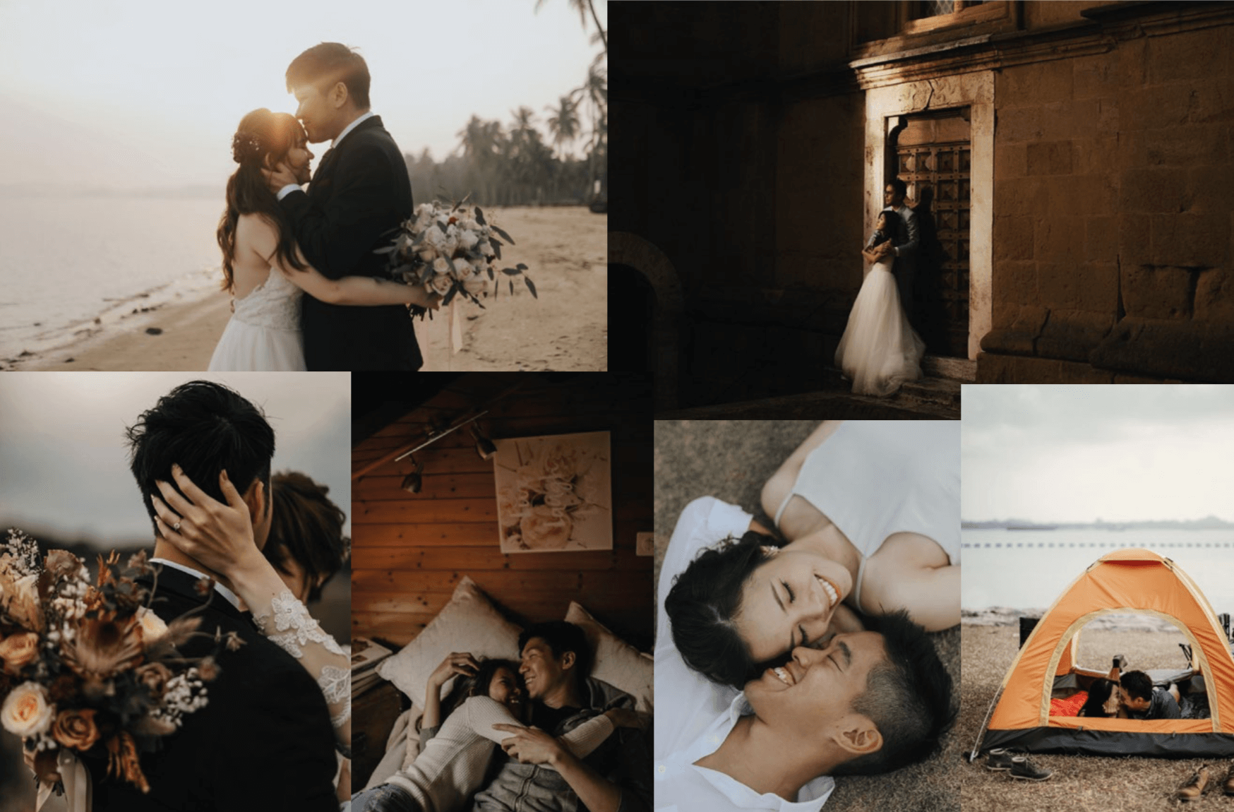
Warm (more orange and yellow tones), high contrast, saturated and slightly muted in greens and blues to bring down the cool tones in the imagery.
(b) Treatment 02: Suited more towards mood shots if needed to
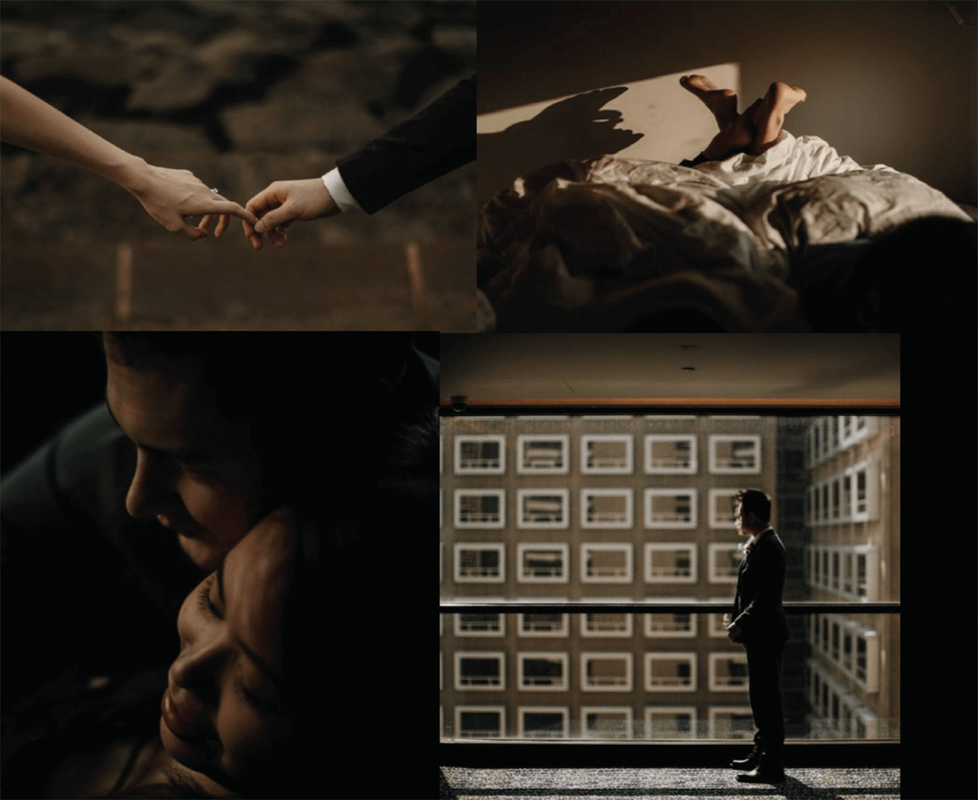
Warm (more orange and yellow tones), imagery could be dark to focus on details and in high contrast. Treatment for mood shots can also be in black and white.
Moodboard for Treatment 01 (images are for reference and taken from other websites)
Moodboard for Treatment 02 (images are for reference and taken from other websites)
03. art direction
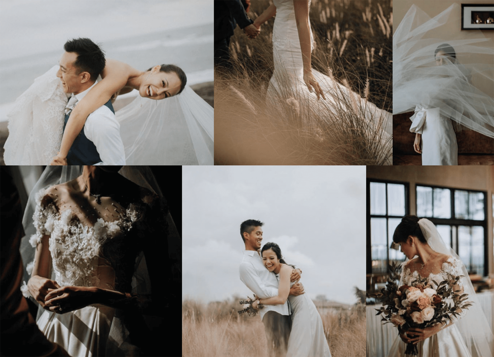
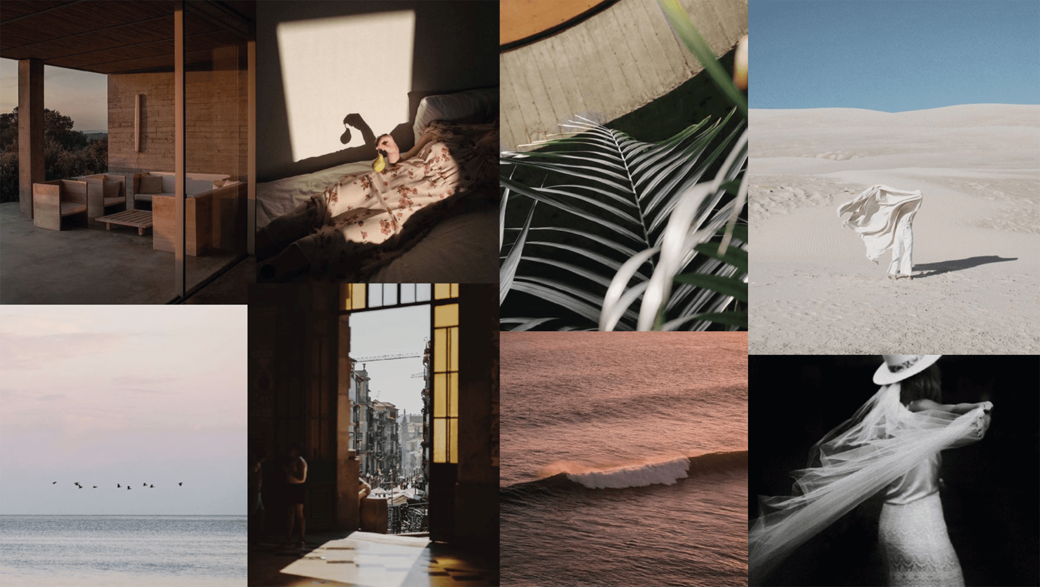
The idea of the main art direction is to have more imagery that are caught in the moment instead of showing just faces of couples; to play with lights, shadows, emotions, depth of field and in different angles.
Other than focusing on details, the direction of mood shots can also show photography and videography skills in other areas apart from weddings (or couples). It would help consumers to get a sense of the style of the brand, where they draw inspirations, other moments the brand focus on that bring out the mood of the shoots.
A few examples of the direction of mood images can stem from—just to name a few—photography, art and travel.
Moodboard of Main Art Direction (images are for reference and taken from other websites)
Moodboard of Direction of Mood Shots (images are for reference and taken from other websites)
04. logo
Logo was simplified and edited to suit the new brand identity.
Initial Logo
New Logo
05. brand colours
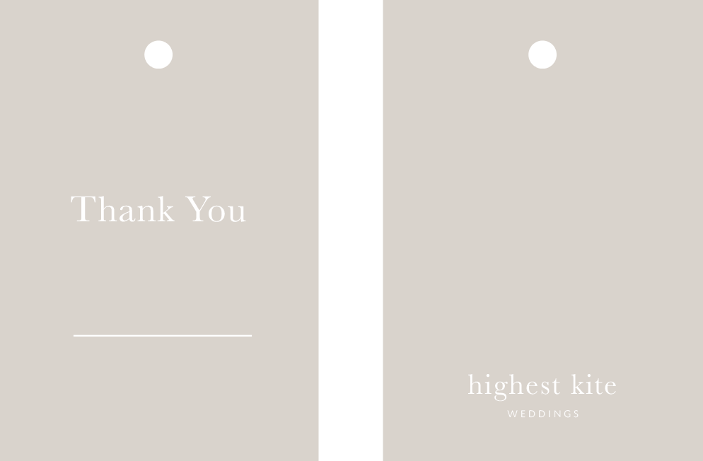
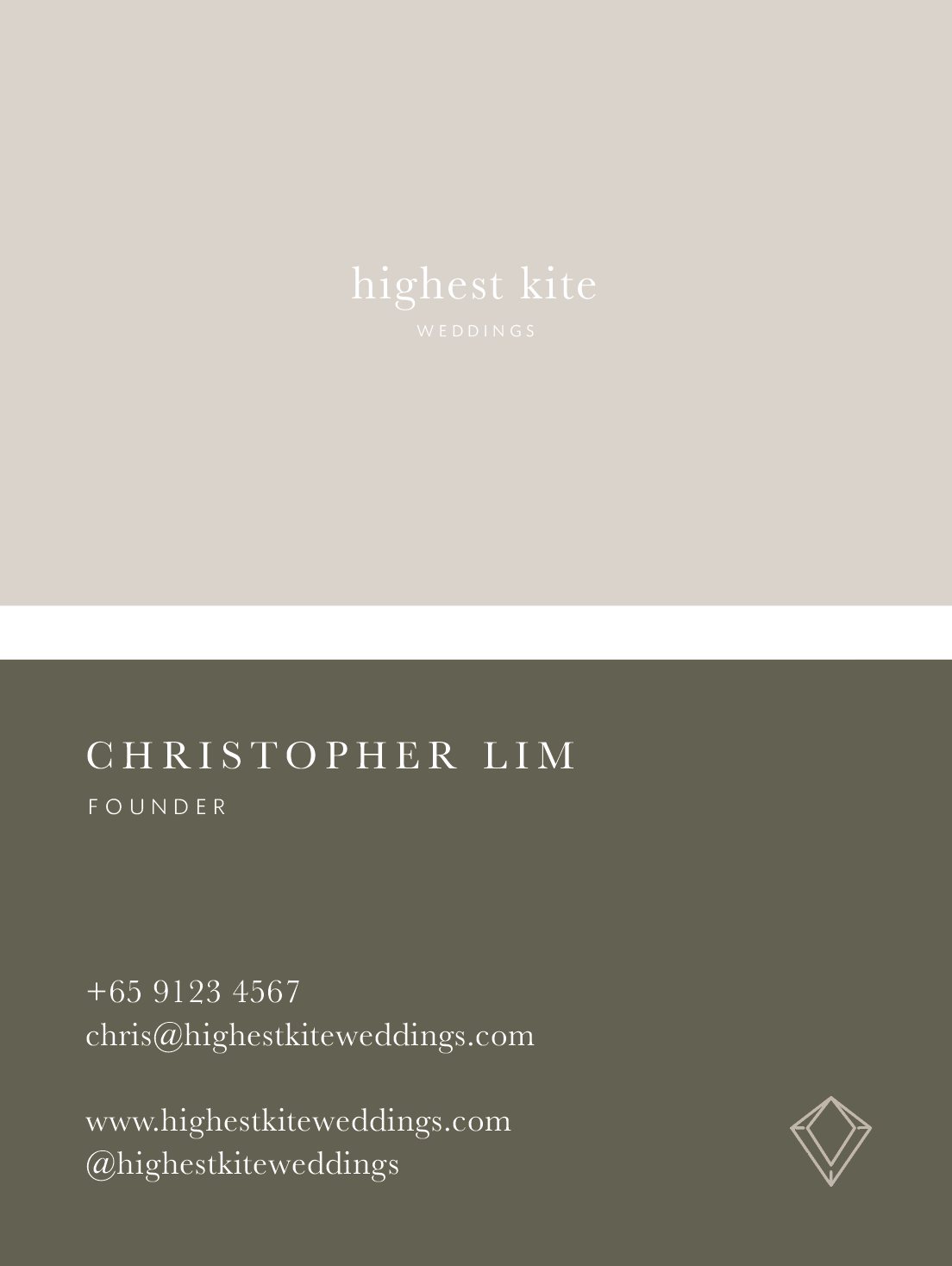
As visuals are key and the main selling point for the brand, the primary brand colour—beige—was chosen to compliment the photographic treatment. As for secondary colours, olive and a warm-toned maroon shade was chosen to set a contrast to the primary colour.
Example 01: ‘Thank You’ tag design
Example 02: Name Card design
Example 03: Rate Card design
(Copies are not true to the brand and image is used only for mock up reference, taken from other websites)
Example 04: ‘Thank You’ Card design
06. website and tone of voice
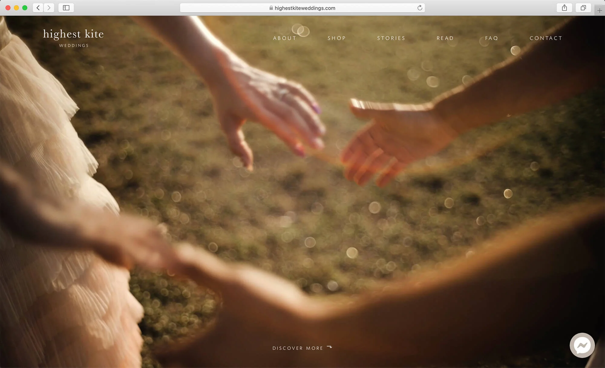
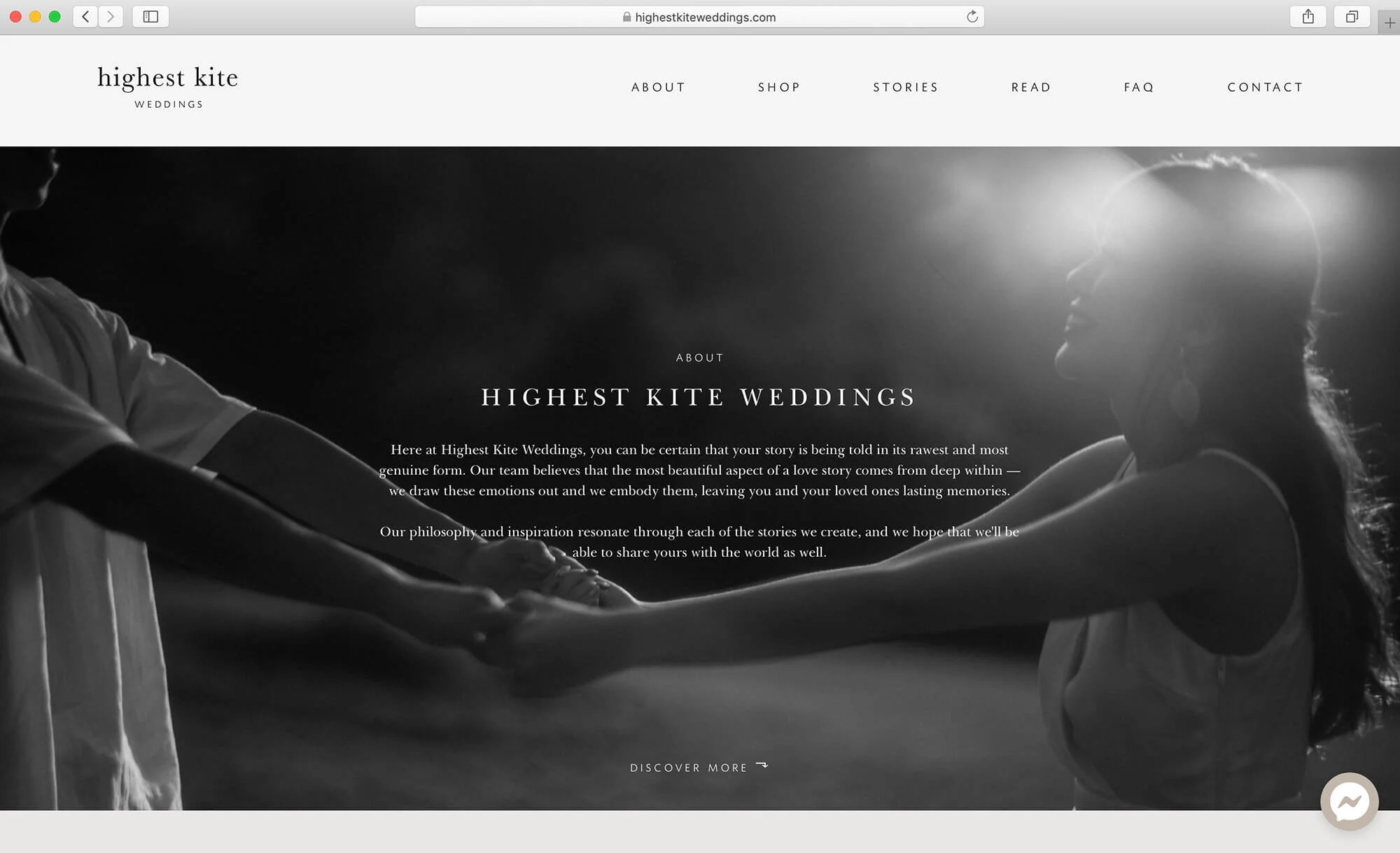
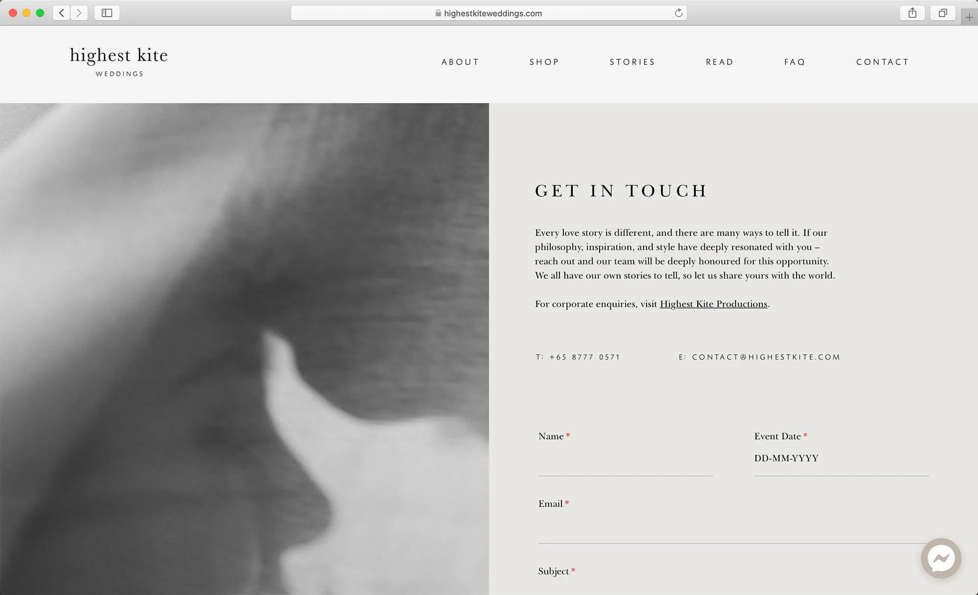
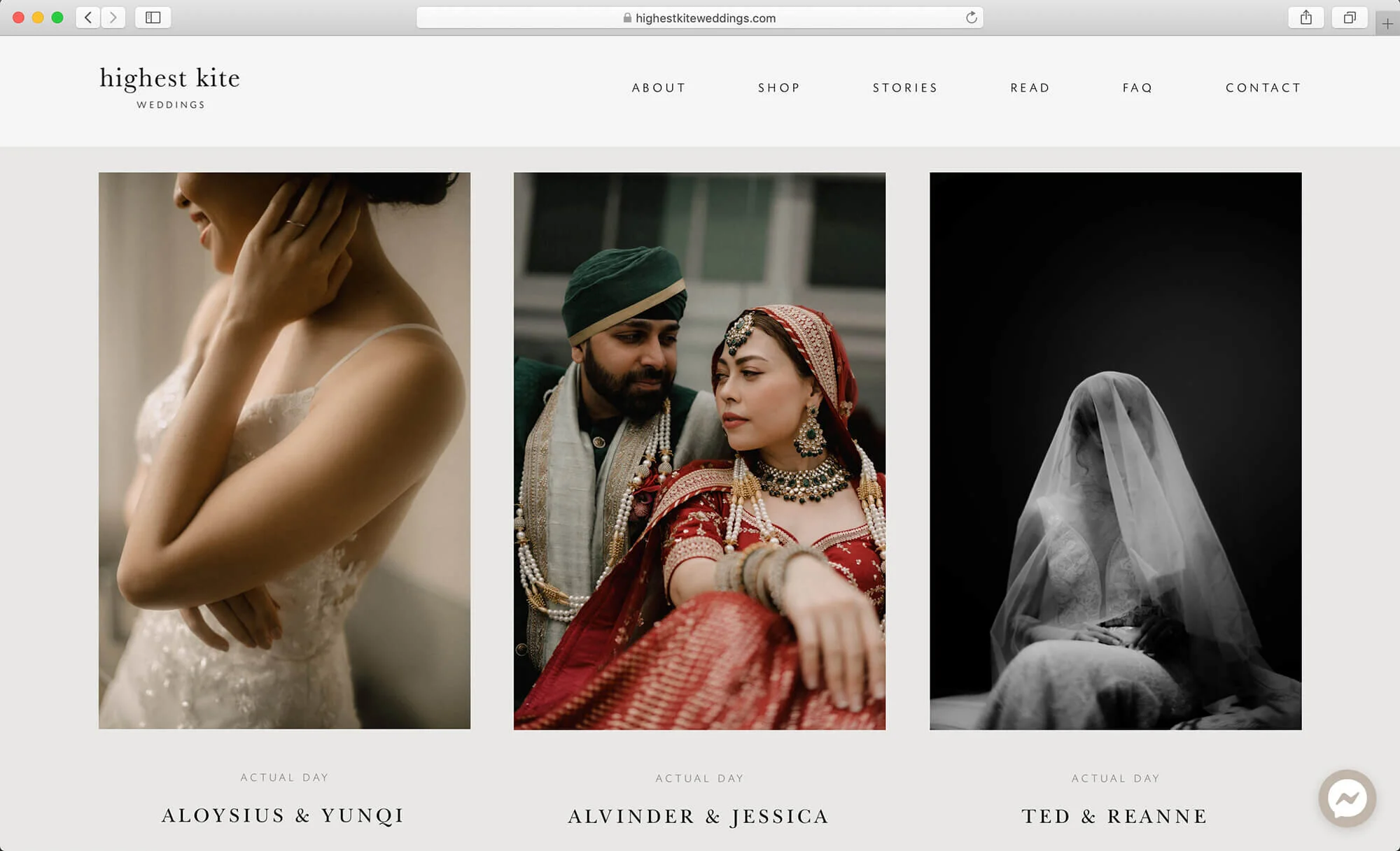
With new branding guidelines in mind, the entire website was re-designed from scratch using FloThemes. Tone of voice was also tweaked and implemented throughout all copies, hoping to evoke feelings and emotions from the shoots. Weddings are intimate; hence the tone of voice should sound personal and sincere to connect more with consumers.
06. social media
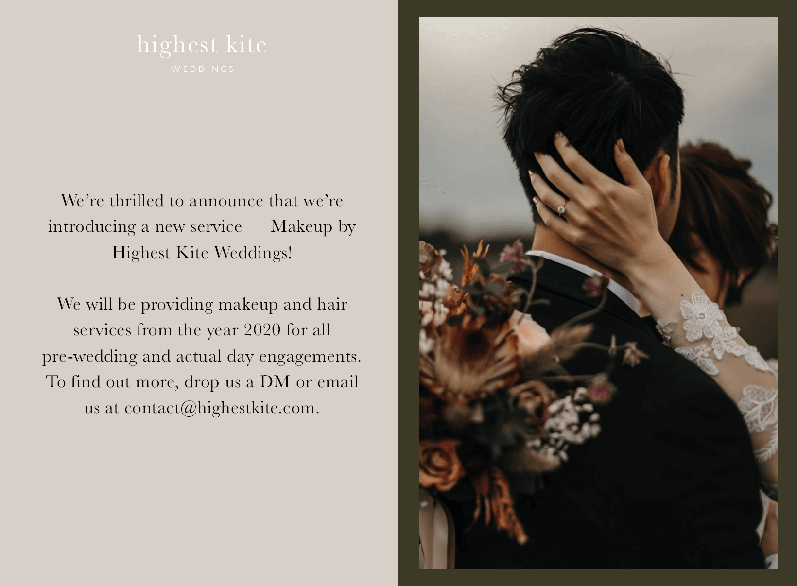
Previous Instagram Highlights was removed and tweaked so that the content would be more helpful and engaging to consumers. For example: an FAQ highlight on their recent campaigns that they provide amidst the Covid-19 situation and creating Instagram templates. The Instagram account have since grown from an estimated of 6.2k followers (see image below) in 2020 to 11k followers in 2023, and more as they grow.
Visit Highest Kite Wedding’s Instagram for content and visuals with the new brand identity.

