Can You Hear Us?
(Branding, Project Management, Product Design)
What if we could see with our ears? We go about in our day looking at things, but not truly seeing them. Ironically, it’s only when we close our eyes that we can actually see a lot clearer and what’s in front of us becomes abundantly clear.
User experience (UX) design is all about visuals — creating a product or service that is visually appealing. But when vision takes precedence over sound, we neglect the power of our ears and the experiences and emotions they can elicit.
With this in mind, we were curious to explore how voice UX impacts our daily lives. With the support of Artwave Studio, we dig into the role that sounds and voice play in our modern lives. Exploring various instances such as in fitness, games, and books, we strip our senses back and tap on our ears instead of our eyes in our inaugural podcast series, Can You Hear Us?
branding
Brand Colours, Visual Style and Type
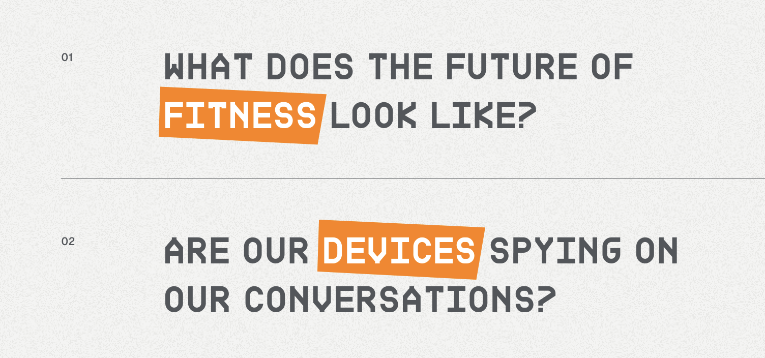
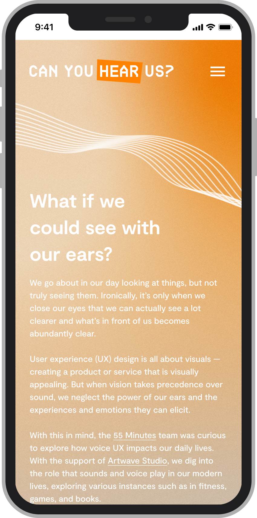
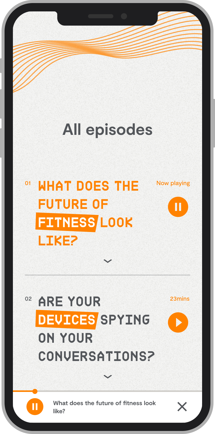
As it’s our first podcast series, it’s important to have a brand presence. As such, we decided to stick with the company’s brand colours — orange, dark grey, and light grey. For the typeface, as the podcast was meant to show the fun and experimental side of us, a different typeface was chosen. Inspired from the topic of the series focusing on Voice UX, an angular and structured typeface was chosen for the title to give it a more technical and futuristic vibe. A square, angular and irregular rectangle shape is also introduced as a experimental way to highlight text.
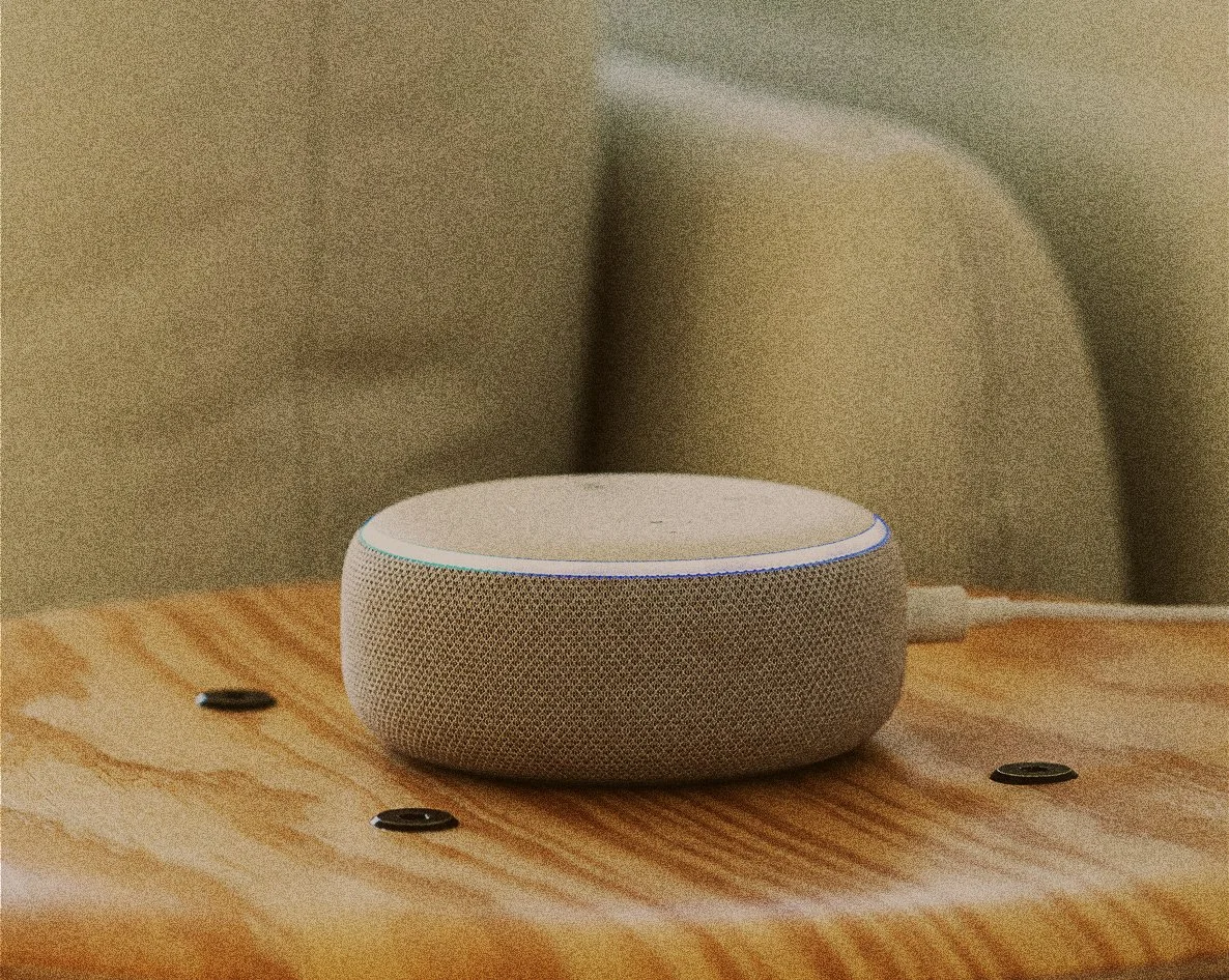
Voice UX is still an area that has yet to be widely explored in the design and product industry. We have come a long way, but as it largely involves the use of technology, there are definitely still tons of potential that we can tap on for Voice UX to solve problems. However, voice and sound itself has existed in our lives way before we realised that it could be the next big thing that impact our lives. Hence to pay homage to that, the visual style was intentionally set to juxtapose the typeface. Think images that are pixelated, over-contrasted, and overlayed with an orange tint.
product Design
Approach
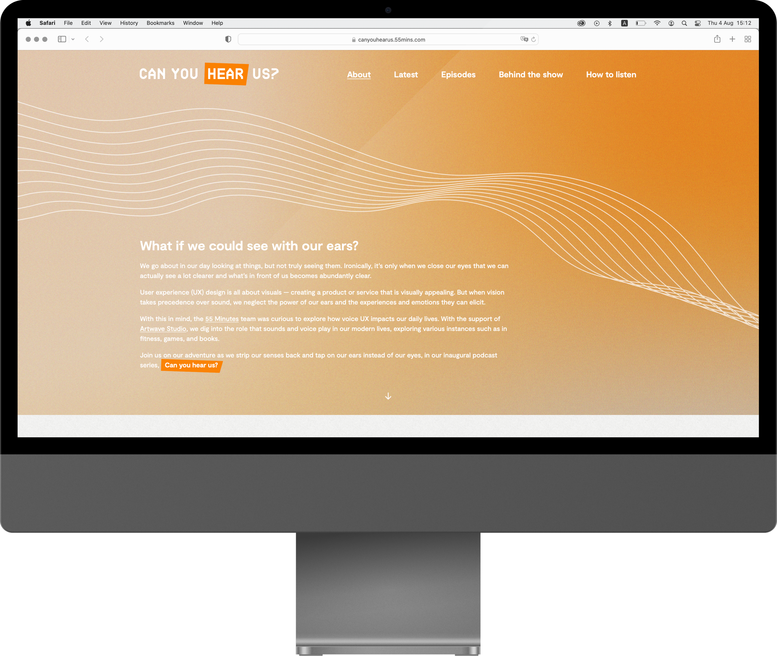
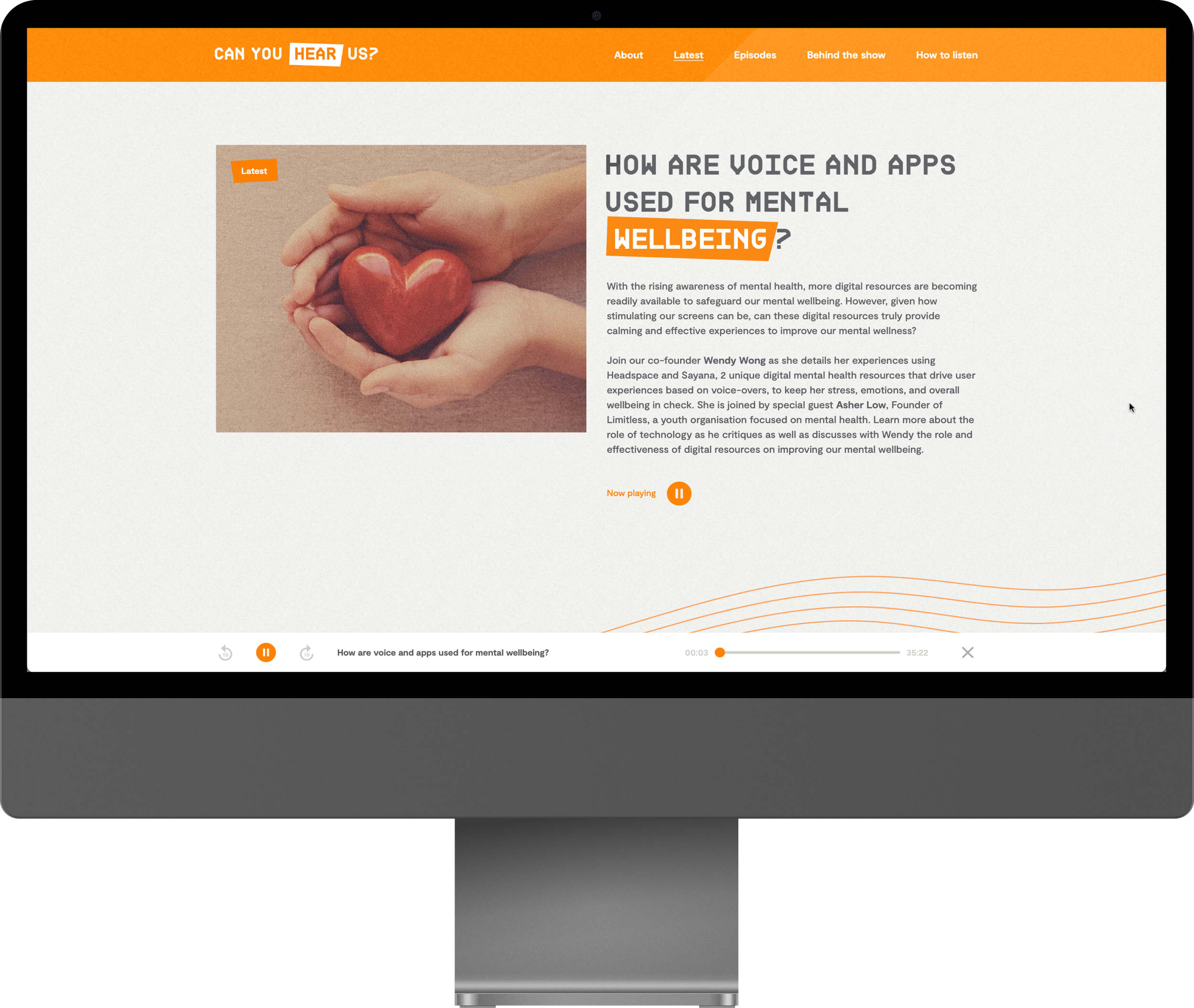
The idea of a one-page microsite is so that users can access all information on a page seamlessly and easily. We wanted to encourage users to listen to the episode on the spot, and hence the idea of being able to listen to the podcast on the microsite itself. The pixelated imagery treatment is replicated in the background of the microsite as well, with different shades of orange in gradient.
Description of each episode are also revealed when hovered over the title of each episode. This is done so that users would not be overwhelmed by the lengthy description for each podcast episode, and this action of “hovering to read” allows users to focus on other content, and read the description only when they want to.
Can You Hear Us? microsite on desktop
Can You Hear Us? microsite on mobile
Can You Hear Us? microsite on mobile
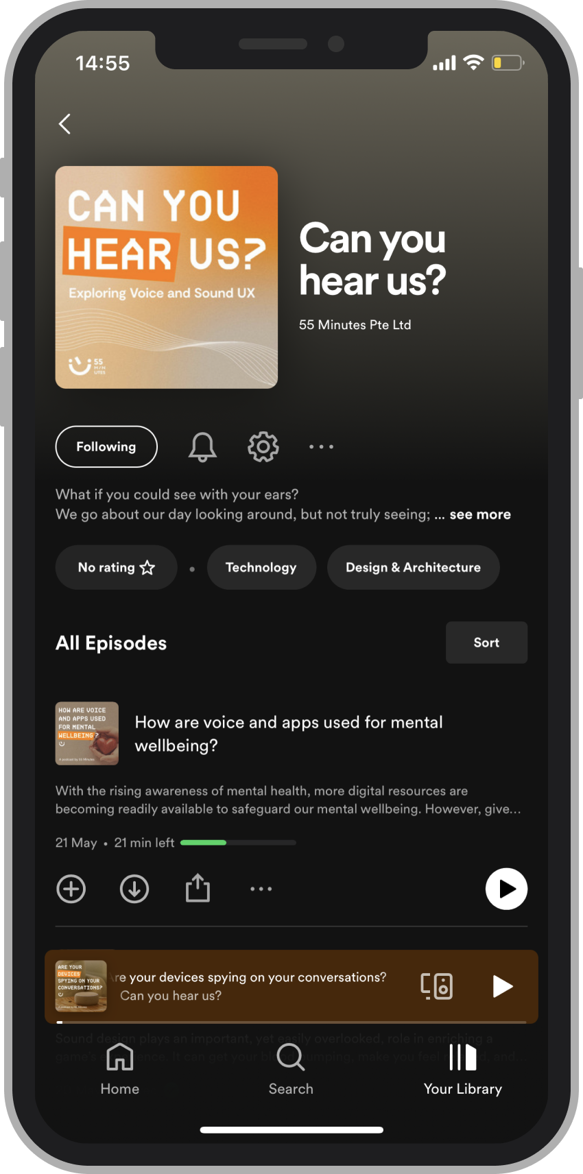
Can You Hear Us? on Spotify

